Safety, Clarity and Ease of Use
Particular attention was paid to the following aspects:
- Accessibility: including AAA-compliant contrast ratios, large font sizes and colour choices suitable for users with visual impairments
- Clear UX writing: straightforward wording, direct language and terminology optimised for older user groups
- Operational safety: large touch targets, ergonomic positioning and reduced content complexity for improved clarity
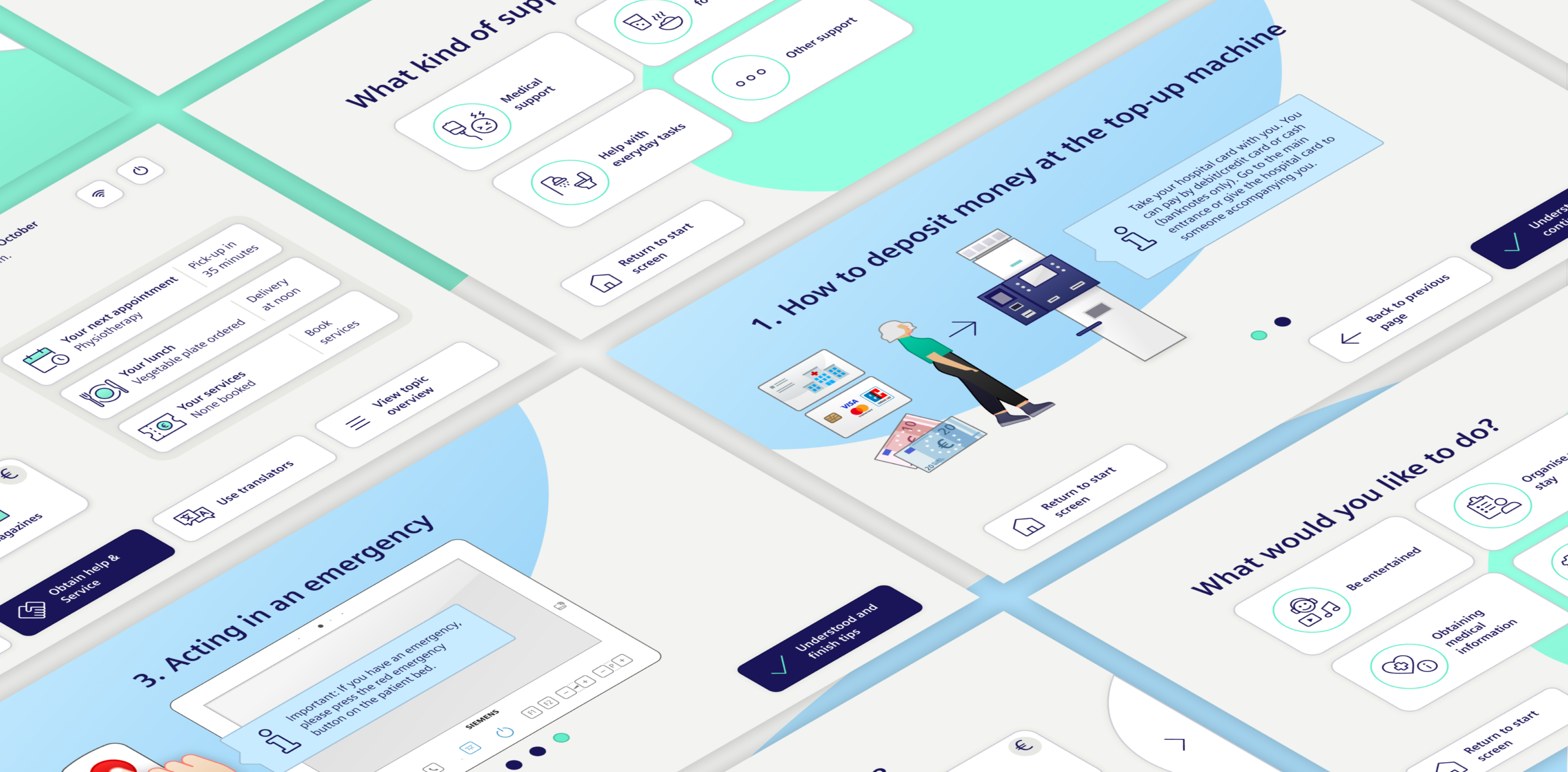
- Friendliness and recognition: distinctive illustrations, customisable colours aligned with hospital branding and a welcoming tone of voice
Design That Provides Guidance and Reassurance
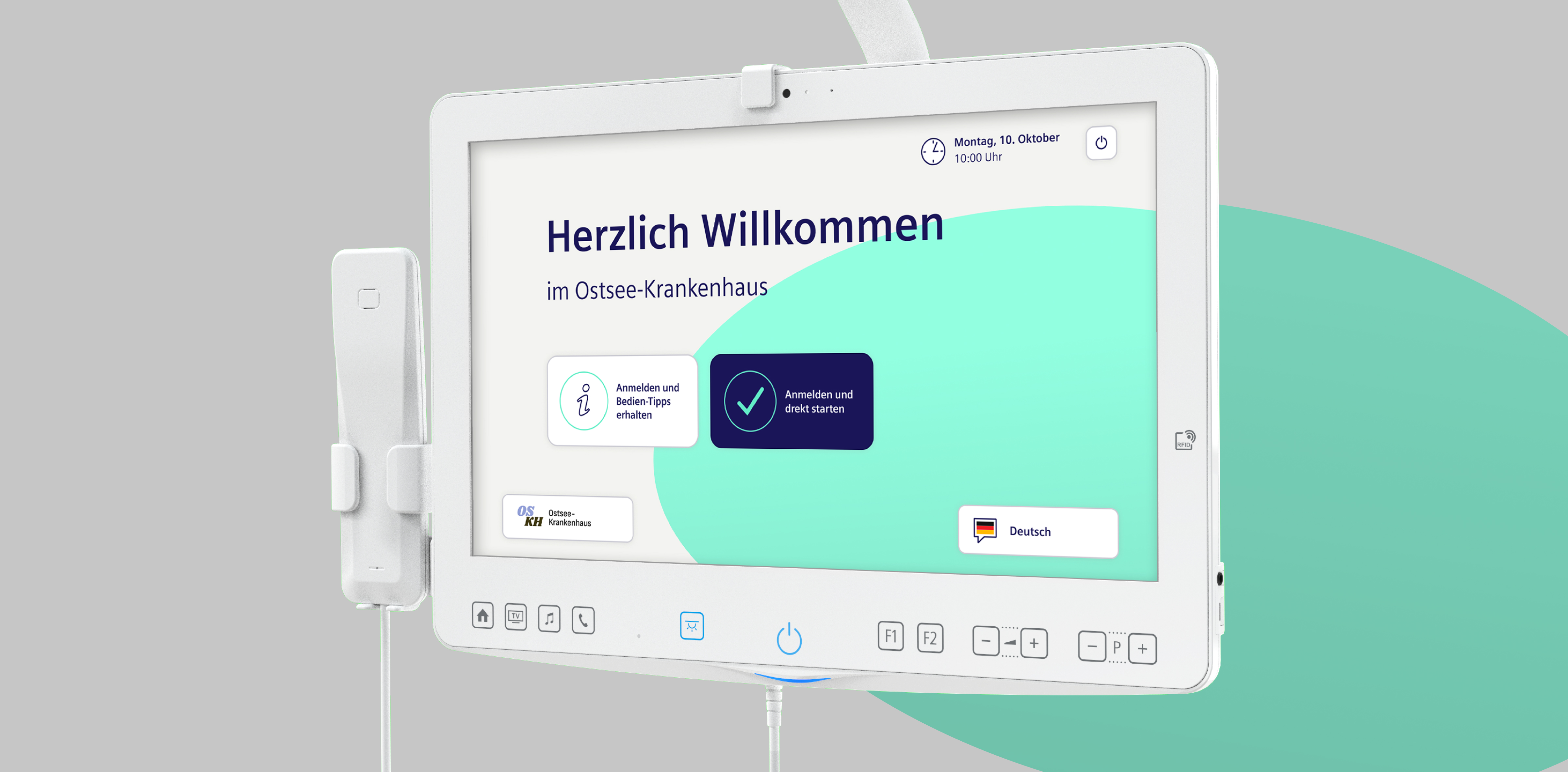
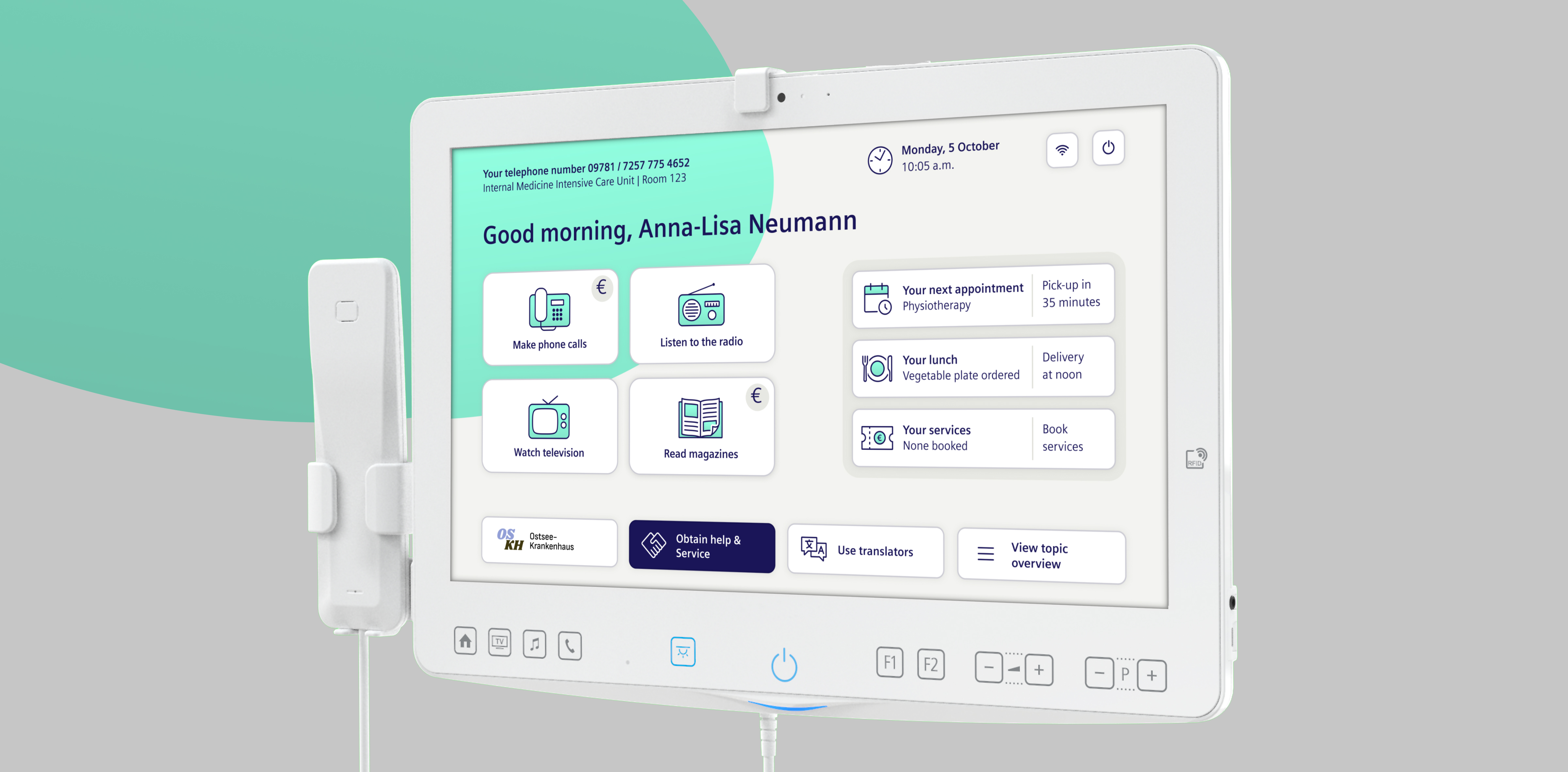
The new UI is designed to convey calmness and structure. A coloured ellipse in the background acts like a spotlight, subtly drawing attention to key actions and functions. This helps users make decisions quickly and confidently without feeling overwhelmed.
At the same time, the ellipse allows different screens to be distinguished at a glance, despite sharing a consistent visual style and layout grid. The result is a visual guidance system that improves orientation and simplifies interaction for all users. The dashboard is clearly structured and immediately highlights the most relevant information, including the current time, location and upcoming events. Key functions remain directly accessible at all times.